ChatGPT: Das Design ist eine radikale Abkehr von der historischen Uniform und setzt auf Arbeit, Bewegung und die moderne Infrastruktur der Post.
Expertin: Der Entwurf verfehlt die wesentlichen Anforderungen an eine funktionale, ganzjährige Arbeitsuniform (fehlende Wetterfestigkeit, eingeschränkte Bewegungsfreiheit). Der Schnitt einer Arbeitsjacke muss zeitlos sein und über viele Jahre aktuell bleiben. Das ist hier nicht gegeben.
(Katrin Lange über die Idee von ChatGpt zur Uniform 03-c: Post Work: Kartografie der Zukunft )
The design is a radical shift away from the historical uniform and focusses on work, movement and the modern infrastructure of the post office.
Expert: The design fails to meet the essential requirements for a functional, year-round work uniform (lack of weather resistance, limited freedom of movement). The cut of a work jacket must be timeless and remain current for many years. This is not the case here.
(Katrin Lange on ChatGpt’s idea for the uniform 03-c: Post Work: Kartografie der Zukunft)
Postuniformen 2025: Wie kreativ ist KI ohne menschlichen Eingriff?
In einem Experiment analysierte ChatGPT historische Dienstkleidung der Deutschen Post aus der Sammlung der Museumsstiftung zu dem das Museum für Kommunikation gehört. Die KI erkannte stilistische sowie funktionale Merkmale und entwarf Vorschläge für das Jahr 2025. Davon ausgehend erstellte der Bildgenerator Midjourney mithilfe von KI-Prompts visuelle Entwürfe. Ein Sammlungskustos und eine Ingenieurin für Bekleidungstechnik prüften die auf den ersten Blick spannenden Ergebnisse und wie kreativ die KI tatsächlich gearbeitet hat: „Entwurf ungeeignet für den tatsächlichen Arbeitsalltag.“ – ist eines der Urteile. Neun der Visualisierungen der Dienstbekleidung sind in der Ausstellung zu sehen.
Post Uniforms 2025: How Creative Is AI Without Human Intervention?
In an experiment, ChatGPT analysed historical postal uniforms of the German Post from the collection of the Museums Foundation, which is part of the Museum of Communication. The AI recognised both stylistic and functional features and came up with suggestions for the year 2025. Based on this, the image generator Midjourney used AI prompts to create visual designs. A curator and a clothing technology engineer reviewed the initially exciting results and assessed how creative the AI had actually been: „Design unsuitable for actual everyday work“ – was one of the verdicts. Nine of the visualisations of the postal uniforms are on display in the exhibition.
Das sagt ChatGPT / so ordnet unsere Sammlung das Objekt ein:
Repräsentation: Die Messekleidung der Deutschen Bundespost diente als seriöse und professionelle Arbeitskleidung, die Verlässlichkeit und Ordnung ausstrahlte.
Sammlung: Es handelt sich hier um reine Behauptungen und recht platte Formulierungen. Da es selbstverständlich ist, dass „unseriöse“ und „unprofessionelle“ Kleidung bei der Post nicht getragen wurde, bringt der jeweils gegenteilige Begriff von der KI keine Erkenntnisse.
Ästhetik: Der Zweiteiler aus einem ärmellosen Kleid und einer kurzen Jacke folgt einer klaren, minimalistischen Linie. Auffällig sind die großen, aufgesetzten Taschen mit Druckknöpfen sowie die prägnante Gürtelschnalle in Metalloptik, die die Taille betont.
Sammlung: Die KI hat keine Probleme damit, widersprüchliche Aussagen zu kombinieren: einerseits „minimalistische Linie“ und anderseits Begriffe wie „auffällig“ oder „prägnant“. Metalloptik klingt gut, ist aber wieder so ein ‚aufgeblasenes‘ KI-Wort, das Eindruck macht. Ist es eine Metallschnalle (das klingt natürlich nicht so eindrucksvoll) oder ist es eine Schnalle, die nur der Optik nach wie Metall aussieht?
Farbgebung: Statt dem typischen Postgelb zeigt sich das Design in einem warmen, kräftigen Orange, das einen modernen, aber dennoch institutionellen Charakter hat.
Sammlung: Die KI behauptet indirekt, dass die Messekleidung der Bundespost immer „Postgelb“ war, das ist aber falsch. Auch kann sich die KI nicht entscheiden, ob dieser Orangeton nun warm oder kräftig ist. Wieso die Farbe Orange einen „institutionellen Charakter“ hat (eigentlich war dies laut KI Postgelb) erschließt sich nicht und bleibt wieder eine Phrase der KI, die sich recht geschmeidig liest. Wenn man nicht aufpasst, glaubt man am Ende diese Sätze noch.
Geschlechterrollen: Der taillierte Schnitt und die verkürzte Jacke unterstreichen eine betont feminine Silhouette, typisch für die Mode der 1970er-Jahre, in der Berufsbekleidung für Frauen oft an konventionelle Eleganz angelehnt wurde.
Sammlung: Während der Anfang recht passabel ist, kommt am Ende wieder eine KI-typische Wortschöpfung, deren Zusammenhang zum Satzanfang unklar bleibt: „konventionelle Eleganz“.
Praktikabilität: Die Konstruktion ist funktional, leicht reproduzierbar und gleichzeitig repräsentativ. Die Materialwahl dürfte auf Langlebigkeit und Tragekomfort ausgelegt sein.
Sammlung: Hier scheint die KI im falschen Film gelandet zu sein, fast ist zu glauben, es handele sich um ein Fahrzeug, da stört nur der „Tragekomfort“. Messekleidung war generell nicht für eine Vielzahl von Messen ausgelegt, also eher Kurzlebigkeit. KI koppelt den Tragekomfort an die Materialwahl, dabei dürfte wohl eher der Schnitt hierfür auschlaggebend sein. Auch hier präsentiert die KI eine Aneinanderreihung von floskelhaften und unbelegten Begriffen.
KI- Weiterentwicklung: Die KI schlägt vor (Konzept und Text-to-Image-Prompt ChatGPT; Visualisierung Midjourney) / so ordnet das die Expertin Katrin Lange, Designerin & Ingenieurin für Bekleidungstechnik, ein:
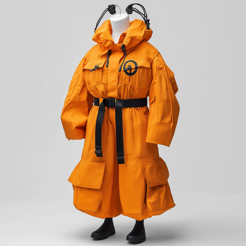
Farbe & Signalwirkung: Intensiviertes Orange mit reflektierenden, metallisch-schwarzen Streifen für maximale Sichtbarkeit.
Expertin: Hier orientiert sich die KI stark an Sicherheitskleidung, wie man sie eher zum Beispiel im Straßenbau verwenden wü Der Aspekt der Sichtbarkeit ist extrem dominant und wirkt übertrieben.
Silhouette & Ergonomie: Von tailliert zu geschlechtsneutral und oversized – für mehr Bewegungsfreiheit.
Expertin: Die Jacke ist zu kurz für den Einsatz im Arbeitsalltag. Ein Bündchen in der Taille würde stören und verrutschen und bei kaltem Wetter den unteren Rücken nicht schützen.
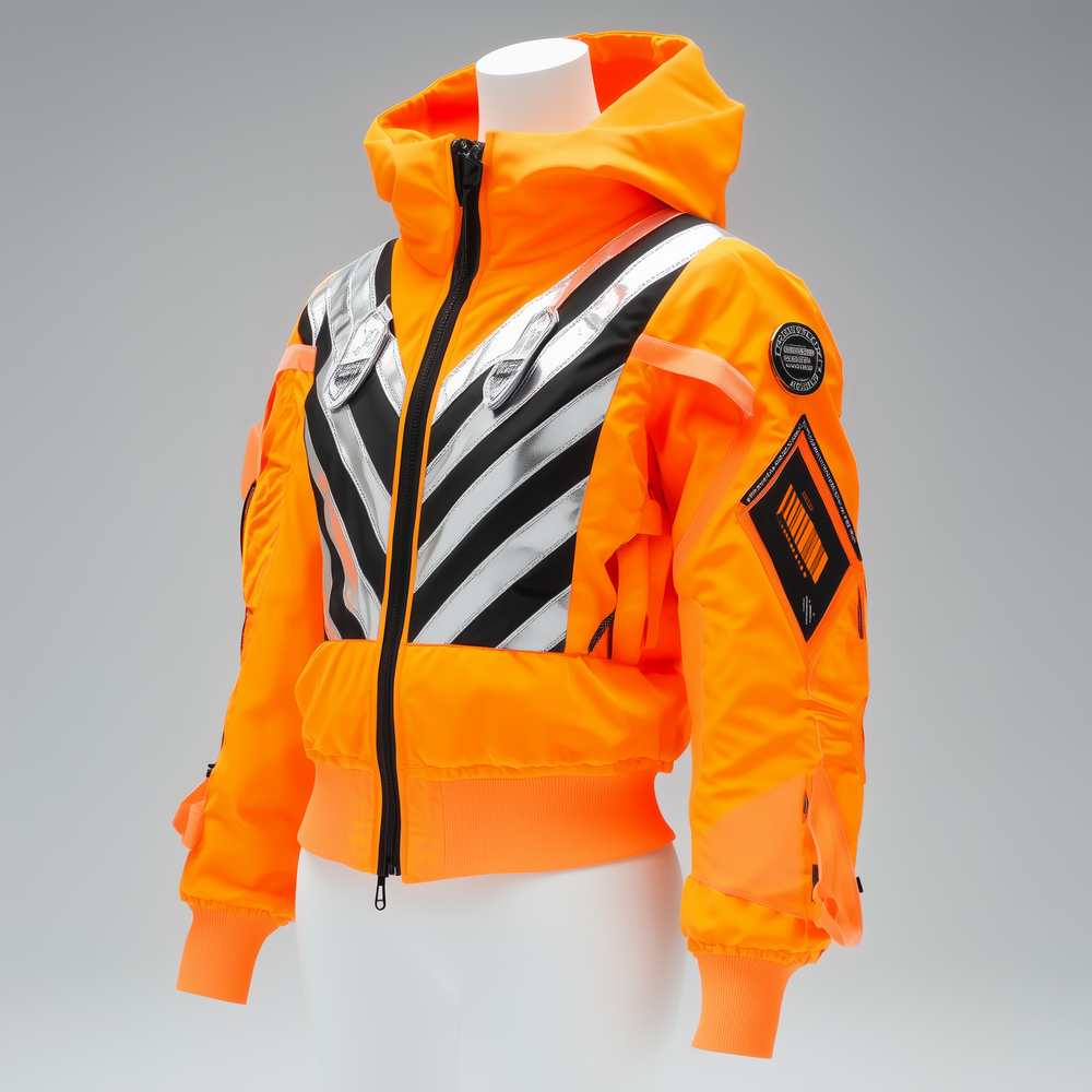
Uniform 01-a: Post-Future: Funktion trifft Signalwirkung
Dieser Entwurf kombiniert Tradition mit Funktionalität. Neonorange mit reflektierenden Details sorgt für Sichtbarkeit und Sicherheit in urbanen Arbeitswelten.
Material & Nachhaltigkeit: Recyceltes, wasserabweisende Hochleistungs-Polyester für Langlebigkeit.
Expertin: Funktionskleidung wie diese wird aus technisch anspruchsvollen Materialien wie zum Beispiel Gore-Tex hergestellt.
Funktionalität & Modularität: Abnehmbare Ärmel und flexible Anpassungen für verschiedene Einsatzbereiche.
Details: Sportliche Bündchen und Utility-Patches ersetzen die Gürtelschnalle für Individualität und Corporate Design.
Expertin: Die Ärmelbündchen wären besser innerhalb des Ärmels untergebracht, da sie sonst bei Regen Wasser aufnehmen.
Fazit ChatGPT: Ein nachhaltiges, inklusives und funktionales Design, das Schutz, Repräsentation und Zeitgeist vereint.
Fazit Expertin: Eine Jacke, die im Ansatz den Anforderungen einer modernen Arbeitskleidung entspricht. Wirkt eher modisch als funktional. Eher Sicherheitskleidung als Uniform. Branding ist unzureichend. Einige Details sind unpraktisch
Das sagt ChatGPT / so ordnet unsere Sammlung das Objekt ein:
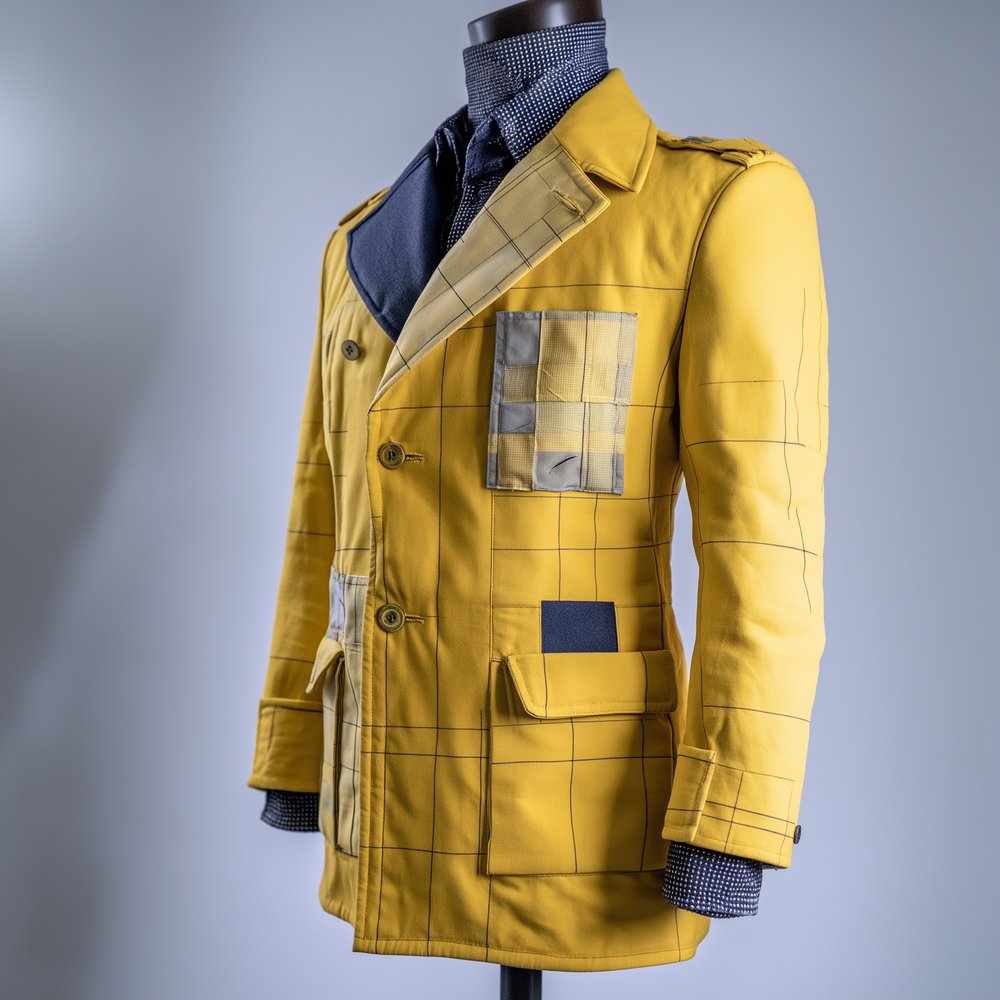
Repräsentation: Sie machte den Postillion als offiziellen Vertreter der Postverwaltung kenntlich und signalisierte Autorität und Erfahrung.
Sammlung: Diese Formulierung stimmt. Möglicherweise hat die KI den Begriff „Erfahrung“ aus der umfangreichen Objektbeschreibung der Museumsstiftung abgeleitet, dort heißt es „vorwurfsfreie Dienstzeit des Postillions“.
Farbgebung: Gelb mit kornblumenblauen Akzenten, die die Zugehörigkeit zur Post unterstrichen. Gelb war traditionell die Farbe des Postdienstes, während Blau Rangabzeichen und regionale Zuordnung betonte.
Sammlung: Die KI ist auch hier wieder auf Gelb als die Farbe der Post fixiert, das hat aber mit der gezeigten Uniformjacke nichts zu tun. Die Farbwahl verweist auf die sächsische Postverwaltung, die diese festgelegt hat. Den Begriff „kornblumenblau“ hat die KI von der Objektbeschreibung der Museumsstiftung übernommen. Die Farbe Blau mit „Rangabzeichen und regionaler Zuordnung“ in Verbindung zu bringen ist unsinnig. Zum einen werden hier zwei verschiedene Aspekte zusammengerührt, zum anderen ist blau nicht generell die Farbe der Rangabzeichen und bei dieser Uniform gibt es gar keine Rangabzeichen.
Schnitt: Ein figurbetonter, taillierter Schnitt mit hoher Knopfleiste, der Ordnung und Disziplin ausstrahlt, während die verstärkten Schultern eine robuste Statur betonen.
Sammlung: Selbstverständlich wurde bei den Postverwaltungen der deutschen und auch anderen Länder auf Ordnung und Disziplin Wert gelegt. Das ist aber ein Allgemeinplatz und keine Information. Was eine „hohe Knopfleiste“ ist, bleibt ungeklärt und ist einfach so als Begriff in die Antwort gestreut. In Kombination mit Begriffen wie der „robusten Statur“ landet die KI auch hier bei einer uninspirierten Aneinanderreihung von Worten ohne Erkenntnisgewinn.
Verzierung: Die acht silbernen Knöpfe mit dem sächsischen Wappen zeigen die Zugehörigkeit zum Königreich Sachsen. Die drei Tressenbänder am linken Ärmel verweisen auf eine ehrenvolle und vorwurfsfreie Dienstzeit – ein Prestigeelement innerhalb der Beamtenkleidung.
Sammlung: Der erste Satz ist korrekt. Der Anfang des zweiten Satzes stammt von der Objektbeschreibung der Museumsstiftung. Das Ende des zweiten Satzes ist neu, die Formulierung „Prestige“ ist bei einer 150 Jahre alten Jacke etwas unglücklich gewählt.
Funktionalität: Sie musste strapazierfähig sein, um den Witterungsbedingungen und langen Reisen auf der Postkutsche standzuhalten. Eine kleine versteckte Tasche in der Innenseite der Schöße war vermutlich für offizielle Dokumente oder persönliche Gegenstände gedacht.
Sammlung: Die KI hat in seiner Antwort vom Postillion auf die Postkutsche geschlossen. Generell wurde bei Dienstkleidungen darauf geachtet, dass sie nicht zu schnell verschlissen wurden. Allerdings war in den Vorschriften der jeweiligen Kleiderkassen die Tragezeit von Jacke, Hose und Mantel genau festgelegt. Und eine Jacke wurde selten länger als 2 Jahre getragen. Für die „Witterungsbedingungen“ gab es einen Mantel und einen Hut. Den Hinweis auf die Innentasche hat die KI aus dem Text der Museumsstiftung übernommen. Ob der Postillion, der diese Uniform getragen hat, für „lange Reisen“ eingesetzt war, ist der Museumsstiftung nicht bekannt und von der KI hinzugedichtet worden.
KI- Weiterentwicklung: Die KI schlägt vor (Konzept und Text-to-Image-Prompt ChatGPT; Visualisierung Midjourney) / so ordnet das die Expertin Katrin Lange, Designerin & Ingenieurin für Bekleidungstechnik, ein:
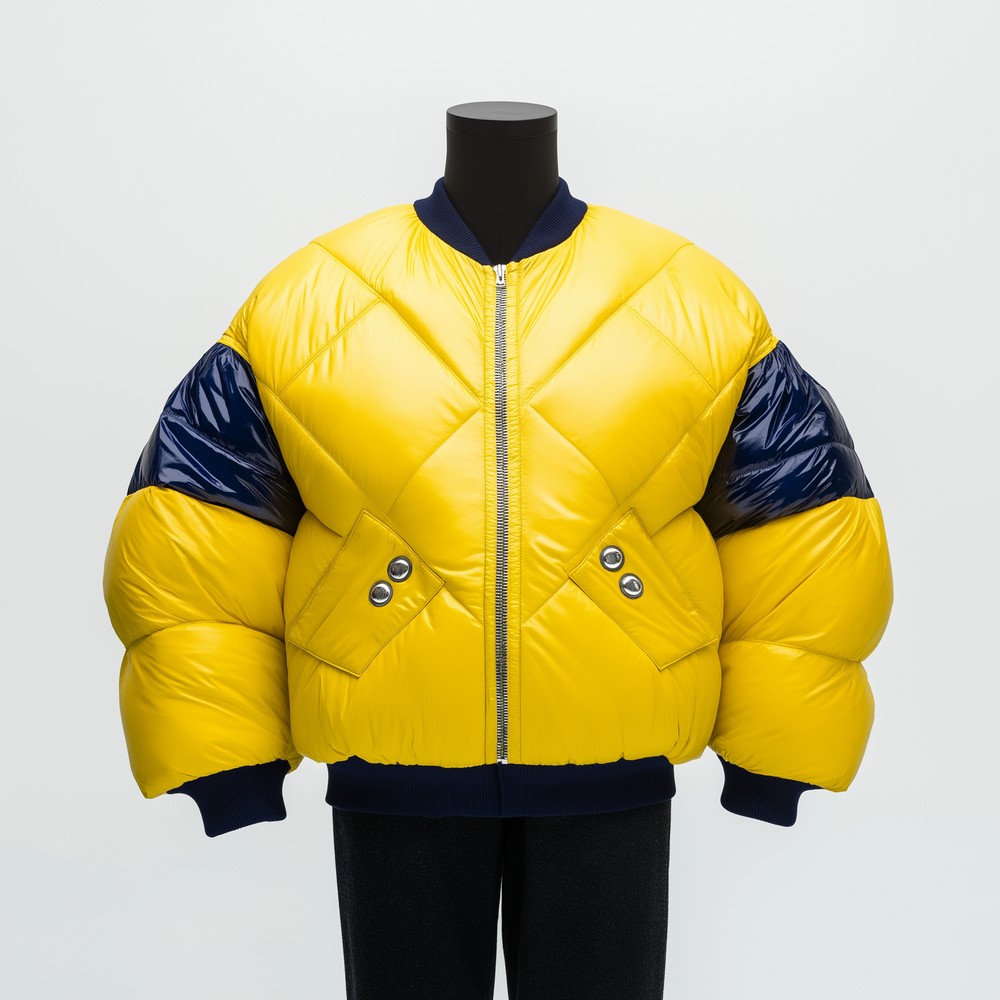
Farbgebung & Kontraste: Die klassische Kombination aus Postgelb und Dunkelblau wird in einer grafischen Zweifarbigkeit neu interpretiert. Gelbe Flächen betonen dynamische Bewegungszonen, während dunkle Partien für einen klaren, strukturierten Look sorgen.
Expertin: Die Jacke hat eine technische Ästhetik mit klaren grafischen Linien in Schwarz und Gelb. Sie wirkt modern, aber nicht unbedingt revolutionär. Die gelben Elemente erhöhen die Sichtbarkeit, die Paspeln könnten aus reflektierendem Material hergestellt sein.
Schnitt & Konstruktion: Das neue Design bietet eine leicht asymmetrische, kantige Form, die an Industrie- und Technikdesign Der leicht verlängerte Vorderbereich bringt einen modernen, funktionalen Look.
Expertin: Diese jetzige Form wirkt eher maskulin, da sie in den Schultern breiter als in der Hüfte geschnitten ist. Das ist für Frauen unbequem, weil die Jacke auf der Hüfte aufliegt und die Bewegungsfreiheit einschränkt. Dies ließe sich leicht ändern, wenn man die Form weniger körpernah gestalten würde.

Uniform 02-b: Post-Tech – Präzision & Funktion im digitalen Zeitalter.
Dieser Entwurf ist eine futuristische Neuinterpretation und übersetzt die Essenz der Post in eine ergonomische und hochfunktionale Arbeitskleidung für das digitale Zeitalter.
Material & Technologie: Die Jacke besteht aus leichtem, wasserabweisendem Tech-Stoff mit hoher Beweglichkeit, ideal für eine dynamische Arbeitswelt. Reflektierende Elemente erhöhen die Sichtbarkeit.
Expertin: Das Material macht den Eindruck, als wäre es wasserabweisend und winddicht, etwa wie Softshell. Damit ist es für ein Bekleidungsstück, das unter verschiedenen Wetterbedingungen getragen wird, gut geeignet. Das Material wirkt allerdings auf dem Bild etwas steif.
Taschen & Funktionalität: Strategisch platzierte Taschen und technische Details wie Laschen, Reißverschlüsse und modulare Befestigungspunkte sorgen für einen individuell anpassbaren Gebrauch des Kleidungsstückes.
Expertin: Gestaltung der Verschlüsse und Taschen wirken etwas unharmonisch und übertrieben, ließe sich aber relativ einfach in eine klare Formensprache überführen. Es fehlen erkennbare modulare oder anpassbare Elemente, welche die Jacke für verschiedene Witterungsbedingungen tauglich machen würden.
Utility-Struktur: Eine integrierte NFC-Tasche für digitale Identifikation oder Arbeitsgeräte ersetzt klassische Wappensymbole.
Expertin: Diese Jacke hat deutlich den Charakter von Arbeitskleidung, auch ein Branding auf der Brust ist vorgesehen.
Fazit ChatGPT: Ein Design, das auf klare Linien, modularerStruktur und funktionale Details setzt und an technische Pläne, digitale Präzision, effiziente Logistik und vernetzte Mobilität erinnert.
Fazit Expertin: Diese Jacke hat ein ausbaufähiges Design, ist aber für funktionale Arbeitskleidung nicht optimal. Die Optik passt in das Bild eines Corporate Brandings. Der Entwurf kann als Inspiration für eine gebrauchstüchtige Jacke dienen und lässt sich mit einfachen Anpassungen umsetzen.
Das sagt ChatGPT / so ordnet unsere Sammlung das Objekt ein:
Repräsentation: Die Uniform war für offizielle Anlässe gedacht und signalisierte Status, Autorität und institutionelle Zugehörigkeit und war von zurückhaltender Eleganz geprägt.
Sammlung: Der Satz ist fast korrekt, nur am Ende muss die KI noch eine Formulierung anfügen, die wahrscheinlich von den die Uniform entwerfenden Beamten der Ministerien wohl nicht beabsichtigt war: „zurückhaltende Eleganz“. Es dürfte sich hier um eine freie Interpretation der KI handeln.
Farbgebung :Dunkelblauer Stoff mit kontrastierenden roten, kunstvoll bestickten Ärmelaufschlägen und Kragen.
Sammlung: Soweit in Ordnung, allerdings passt „kunstvoll“ nicht ganz zu den Stickereien einer Galauniform, die Rang und Macht symbolisierte
Status: Die Uniform zeigte den hohen Rang des Trägers innerhalb der Postverwaltung. Sie wurde bei repräsentativen Anlässen und zu zeremoniellen Zwecken getragen, nicht für den Arbeitsalltag.
Sammlung: Die KI kennt sich auch nicht besser aus als die Museumsstiftung und belässt es beim „hohen Rang“. Das ist eine Relativierung: im Verhältnis zum Briefträger mag das stimmen, im Verhältnis zur obersten Leitung der Post wohl eher nicht. Die KI konnte mit dem Dienstrang „Postmeister“ und dazu noch in einer speziellen Postverwaltung wohl nichts anfangen. Der Begriff „zeremoniell“ ist allerdings für die Anlässe, bei denen die Uniform getragen wurde, unpassend gewählt.
Schnitt:Klassisch-frackartige Silhouette mit langen Rockschößen, die Eleganz und Rang unterstrich.
Sammlung: Soweit in Ordnung, der Begriff „Eleganz“ scheint aber bei einer hierarchischen Organisation wie der damaligen Postverwaltung nicht ganz passend.
Verzierung: Silbergestickte Posthörner als Symbol des Postdienstes und mattgoldene Knöpfe, deren Herkunft uneindeutig bleibt.
Sammlung: Die KI hat vom Text der Museumsstiftung die „Posthörner in Silberstickerei“ übernommen, leicht verändert und mit einem Hinweis „Symbol des Postdienstes“ versehen – das ist korrekt. Auch die Information zu den Knöpfen stammt von der Museumsstiftung, dort ist sie allerdings konkreter und länger: „ob auch die Knöpfe von der alten Galauniform stammen, ist etwas fraglich, da sie auf der Oberseite kein Wappen des Landesherrn zeigen und stattdessen flach und mattgolden sind, wie sie um 1970 als Sakko-Knöpfe typisch waren.
Vom Stil her scheinen sie nicht zur Uniform zu passen.“ Die KI hat hinsichtlich der Knöpfe den Sachverhalt erkannt.
Funktionalität: Diese Galauniform eines hessischen Postmeisters vor 1846 diente als repräsentative Amtskleidung.
Sammlung: Die KI hat hier nur vier Worte an die Formulierung der Museumsstiftung angefügt nämlich „diente als repräsentative Amtskleidung“. Zur Funktionalität bleibt KI aber eine Antwort schuldig.
KI- Weiterentwicklung: Die KI schlägt vor (Konzept und Text-to-Image-Prompt ChatGPT; Visualisierung Midjourney) / so ordnet das die Expertin Katrin Lange, Designerin & Ingenieurin für Bekleidungstechnik, ein:
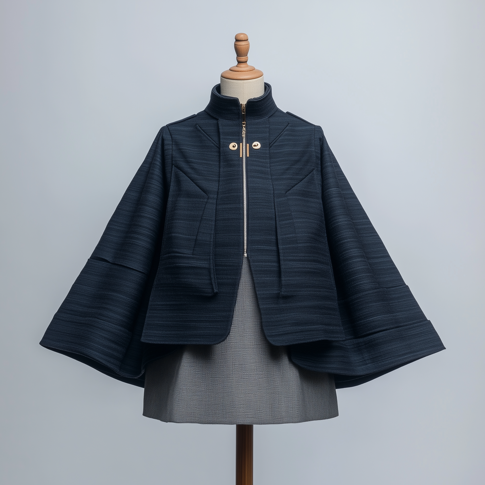
Repräsentation & Wandel: Diese Neuinterpretation verschiebt den Fokus von Status & Hierarchie zu Mobilität & Infrastruktur. Sie reflektiert das moderne Verständnis von Post als dynamisches Netzwerk, das Menschen und Orte verbindet.
Expertin: Das Design dieser Jacke ist modisch-experimentell. Es orientiert sich an Fashion-Trends, nicht an den funktionalen Anforderungen einer Uniform für den Postdienst. Der Bezug zum ursprünglichen Modell wurde aufgelöst bis auf die enge Taillierung.
Farbgebung & Material: Das traditionelle Dunkelblau bleibt erhalten, ist aber in einem kräftigen, technischen Blau ausgeführt, das mit kontrastreichen, sichtbaren Nähten akzentuiert wird.
Expertin: Die Materialanmutung deutet auf eine mittelfeste Baumwolle oder einen Baumwoll-Mix hin, was in Bezug auf Wetterfestigkeit und Atmungsaktivität im Arbeitsalltag ungeeignet ist.

Uniform 03-c: Post-Work: Kartografie der Zukunft
Dieser Entwurf löst die klassische, steife Struktur auf und überführt sie in eine ergonomische sowie dynamische Form.
Text & Botschaft: Die Aufschrift „Post Work“ betont den Wandel von einem symbolischen Rangabzeichen hin zu einer funktionalen Identität – die Uniform ist nicht mehr ein Statussymbol, sondern eine Arbeitskleidung für eine mobile, vernetzte Zukunft.
Expertin: Ein innovativer Ansatz ist erkennbar, aber die praktische Umsetzbarkeit für Arbeitsbekleidung ist nicht gegeben. Lediglich die Farbe und das Logo lassen sich für ein modernes Branding gut verwenden.
Linienführung: Die weißen Nähte erinnern an Pläne, Karten oder logistische Netzwerke, ein Verweis auf die Kartografie des Postwesens – die Bewegung von Menschen, Paketen und Informationen.
Expertin: Besonders auffällig sind die ballonartigen Ärmel und das gesteppte Nahtbild, das einen kreativen, aber vollkommen unpraktischen Eindruck hinterlässt. Die zahlreichen Absteppungen sind herstellungstechnisch machbar, jedoch aufwendig und kostenintensiv und tragen nicht zur Funktionalität bei.
Form & Funktion: Statt strenger Linien hat das Design voluminöse Ärmel, die Flexibilität und Bewegungsfreiheit ermöglichen – ein Bruch mit den engen, hierarchischen Schnitten des 19. Jahrhunderts.
Expertin: Dieser Schnitt ist für eine moderne Arbeitsjacke vollkommen ungeeignet. Hier lässt sich kein Detail finden, das man als Inspiration für eine alltagstaugliche multifunktionale Jacke verwenden könnte. Dies ist ein reines Modedesign. Die weiten Ballonärmel sind hinderlich bei der Arbeit und schränken die Bewegungsfreiheit ein.
Fazit ChatGPT: Das Design ist eine radikale Abkehr von der historischen Uniform und setzt auf Arbeit, Bewegung und die moderne Infrastruktur der Post.
Fazit Expertin: Der Entwurf verfehlt die wesentlichen Anforderungen an eine funktionale, ganzjährige Arbeitsuniform (fehlende Wetterfestigkeit, eingeschränkte Bewegungsfreiheit). Der Schnitt einer Arbeitsjacke muss zeitlos sein und über viele Jahre aktuell bleiben. Das ist hier nicht gegeben
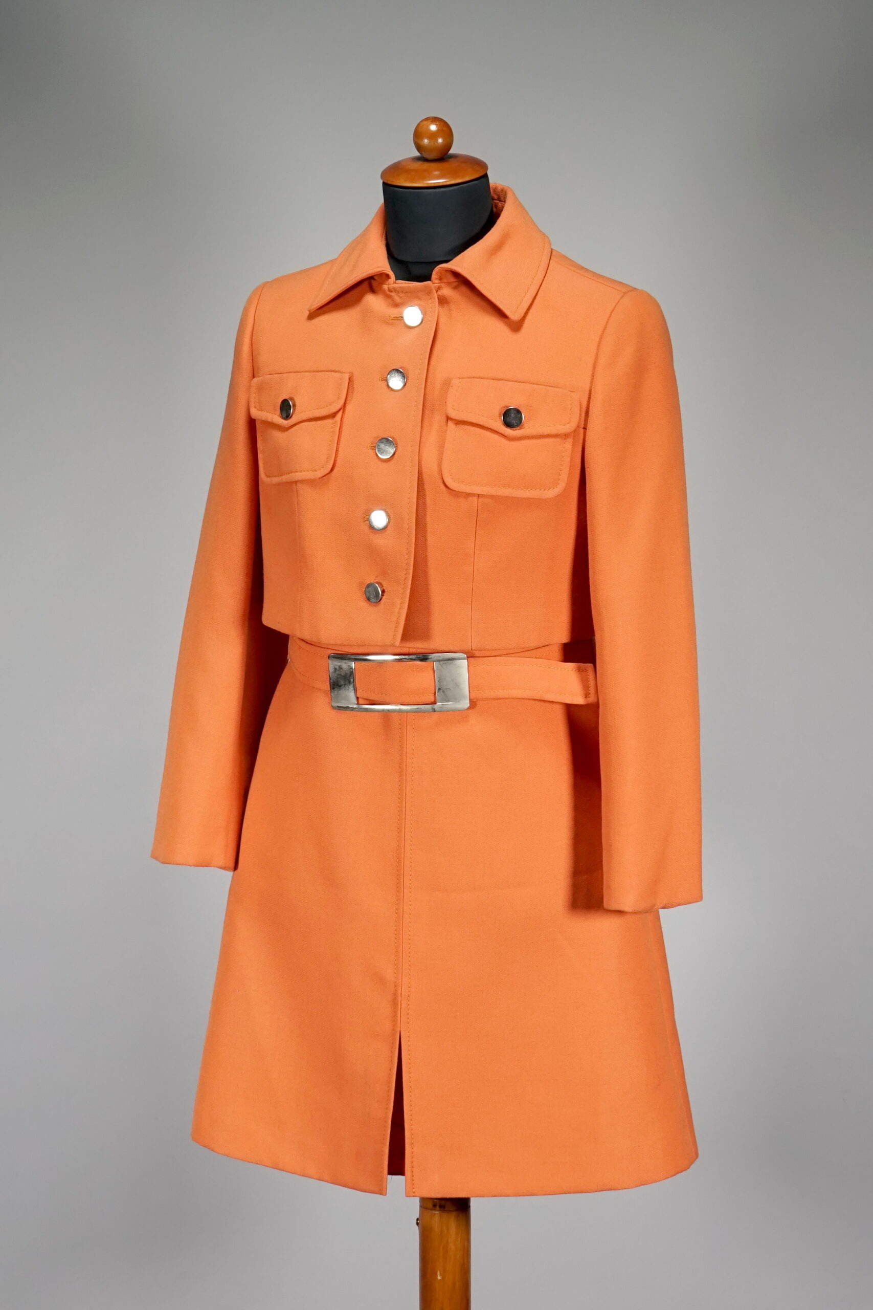
Representation: The trade fair clothing of Deutsche Bundespost served as respectable and professional workwear that exuded reliability and neatness.
Collection: These are mere claims and rather blunt statements. Since it goes without saying that ‘dubious’ and ‘unprofessional’ clothing was not worn at the post office, the opposite term does not provide any insights from the AI. hier um eine freie Interpretation der KI handeln.
Aesthetics: The sleeveless dress and short jacket two-piece follows a clear, minimalist line. Striking features include the large flap pockets with press studs as well as the distinctive metallic-look belt buckle that accentuates the waist.
Collection: The AI doesn’t have any problems combining contradictory statements: ‘minimalist line’ on the one hand and words like ‘striking’ or ‘concise’ on the other. The metal look sounds good, but is another one of those ‘pompous’ AI words that makes an impact. Is it a metal buckle (which of course doesn’t sound so impressive) or is it only a buckle that looks like metal?
Colour scheme: In place of the typical postal yellow, the design is a warm, vibrant orange, which has a modern yet institutional look.
Collection: The AI indirectly claims that the Bundespost’s trade fair clothing was always ‘postal yellow’, but this is false. Nor can the AI decide whether this shade of orange is a warm or a bold colour. It is not clear why the colour orange has an ‘institutional character’ (actually, according to the AI, it was postal yellow) and remains another AI phrase that is quite easy to read. If you’re not attentive, you’ll end up believing these sentences.
Gender roles: The tapered cut and cropped jacket emphasise a distinctly feminine silhouette, typical of 1970s fashion, when workwear for women was often inspired by conventional elegance.
Collection: While the beginning is quite acceptable, there is yet another AI-typical neologism at the end with an unclear connection to the beginning of the sentence: ‘conventional elegance’.
Practicality: The design is functional, easily reproducible and at the same time presentable. The choice of materials should be designed for longevity and wearing comfort.
Collection: Here the AI seems to have landed in the wrong film, it’s almost as if it’s a vehicle, it’s just the ‘wearing comfort’ that’s distracting. Trade fair clothing was generally not intended for a multitude of trade fairs, so it was rather short-lived. AI couples the wearing comfort with the choice of material, although the cut is more likely to be the deciding factor. Once again, the AI presents a series of clichéd and unsubstantiated terms.
Colour & Signaling Effect: Intense orange with reflective, metallic black stripes for maximum visibility.
Expert: Here, the AI is very much orientated towards safety clothing, as would be used in road construction, for example. The visibility aspect is extremely dominant and appears over the top.
Silhouette & Ergonomics: From tapered to gender-neutral and oversized – for more freedom of movement.
Expert: The jacket is too short for everyday work. A waistband would interfere, cause it to slip and not protect the lower back in cold weather.
Uniform 01-a: Post-Future: Function meets Signaling Effect
This design combines tradition with functionality. Neon orange with reflective details ensures visibility and safety in urban working environments.
Material & Sustainability: Recycled, water-resistant high-performance polyester for durability.
Expert: Functional clothing like this is made from technically sophisticated materials like Gore-Tex.
Functionality & Modularity: Detachable sleeves and flexible customisation for different areas of use.
Expert:The cuffs should be placed inside the sleeves, otherwise they absorb water when it rains.
Conclusion ChatGPT: A sustainable, inclusive and functional design that combines protection, representation and zeitgeist.
Expert’s conclusion: A jacket that meets the requirements of modern workwear to some extent. Looks more fashionable than functional. More like protective clothing than a uniform. Branding is inadequate. Some details are impractical.
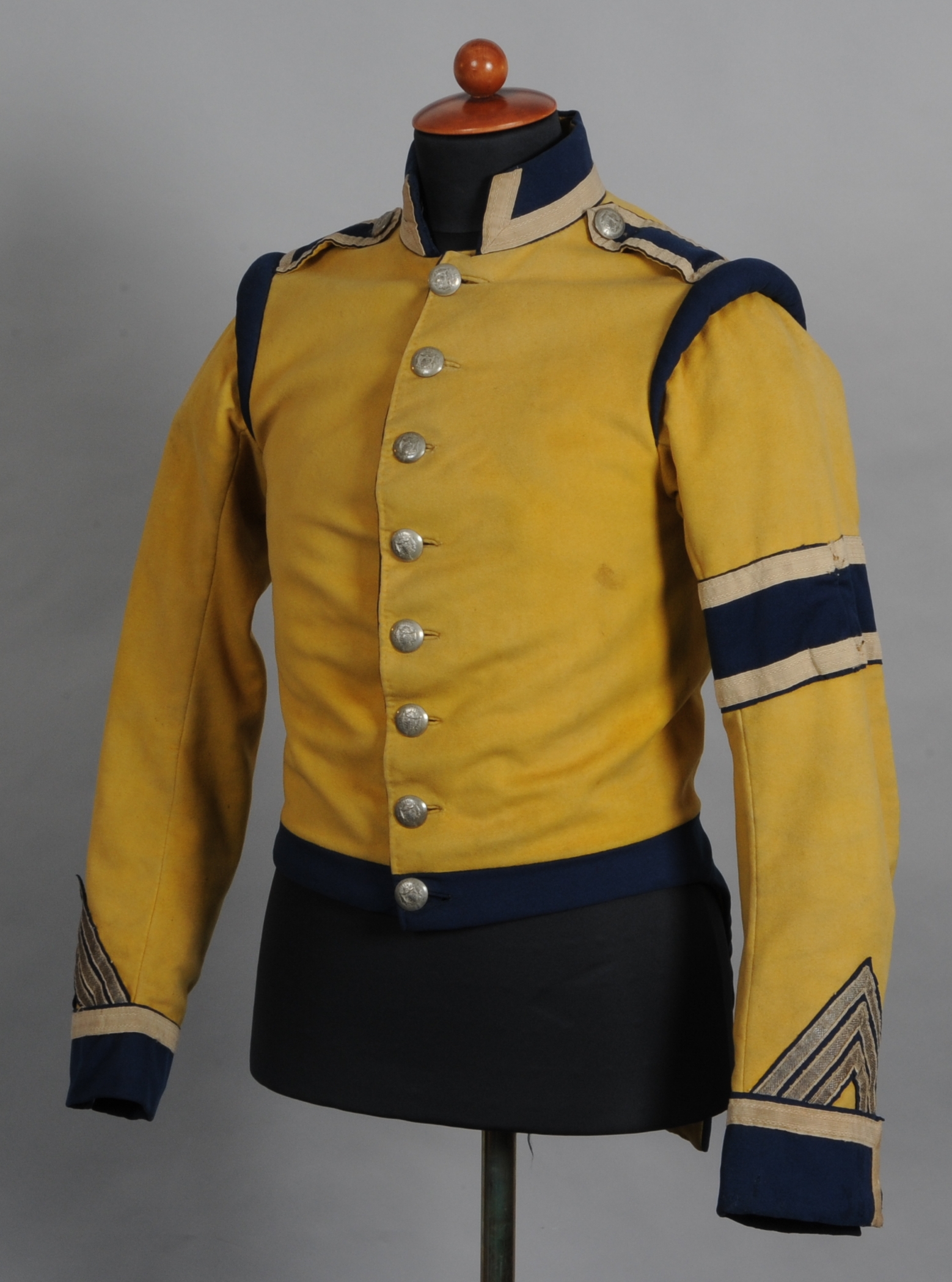
Representation: It made the postillion recognisable as an official representative of the postal administration and signalled authority and experience.
Collection: This wording is correct. The AI may have derived the term ‘experience’ from the extensive object description provided by the museum foundation, where it says ‘reproach-free period of service of the postillion’
Colour scheme: Yellow with cornflower blue accents that underlined the affiliation to the postal service. Yellow was traditionally the colour of the postal service, while blue emphasised rank insignia and regional affiliation.
Collection: The AI is again fixated on yellow as the postal colour, but this has nothing to do with the uniform jacket shown. The choice of colour refers to the Saxon postal administration, which decided on it. The term ‘cornflower blue’ was adopted by the AI from the Museum Foundation’s object description. It makes no sense to associate the colour blue with ‘rank insignia and regional classification’. Firstly, two different aspects are being conflated here; secondly, blue is not generally the colour of rank insignia and this uniform has no rank insignia at all.
Cut: A figure-hugging, tapered cut with a high button front that exudes order and discipline, while the reinforced shoulders emphasise a robust physique.
Collection: The postal administrations of the German and other countries naturally attached great importance to order and discipline. However, this is merely a generalisation and not a piece of information. What a ‘high button placket’ is remains unclear and is simply thrown into the answer as a phrase. Combined with terms such as ‘robust stature’, the AI results in an uninspired string of words with no additional insight.
Decoration: The eight silver buttons bearing the Saxon coat of arms indicate affiliation to the Kingdom of Saxony. The three braid ribbons on the left sleeve are a reference to an honourable and reproach-free period of service – a prestigious element of civil servants‘ clothing.
Collection: The first sentence is correct. However, the beginning of the second sentence is taken from the description of the object by the museum foundation. The end of the second sentence is new, and the wording ‘prestige’ is somewhat unfortunate for a 150-year-old jacket.
Functionality: It needed to be durable in order to withstand the weather conditions and long journeys on the stagecoach. The small hidden pocket on the inside of the lapels was probably intended for official documents or personal items.
Collection: In its response, the AI has assumed that the postillion was a stagecoach. Generally speaking, care was taken to ensure that official garments did not wear out too quickly. Nonetheless, the regulations of the respective clothing departments specified exactly how long jackets, trousers and coats were to be worn. It was rare for a jacket to be worn for longer than 2 years. There was a coat and a hat for ‘weather conditions’. The reference to the inside pocket was taken from the text of the museum foundation. The Museum Foundation does not know whether the postilion wearing this uniform was used for ‘long journeys’ and this information was added by the AI.
Uniform 02-b: Post-Tech – Precision & Functionality in the Digital Age.
This design is a futuristic reinterpretation and translates the essence of the postal service into ergonomic and highly functional workwear for the digital age.
Colour Scheme & Contrasts: The classic combination of post office yellow and dark blue is reinterpreted in a graphic two-tone design. Yellow areas emphasise dynamic zones of movement, while dark areas create a clear, structured look.
Expert: The jacket has a technical aesthetic with clean black and yellow graphic lines. It looks modern, without necessarily being revolutionary. The yellow elements increase visibility, and the piping may be made of reflective material.
Cut & Design: The new design offers a slightly asymmetrical, angular shape reminiscent of industrial and technical design. The slightly elongated front area creates a modern, functional look.
Expert: This present shape looks more masculine as it is cut wider at the shoulders than at the hips. This makes it uncomfortable for women because the jacket rests on the hips and restricts freedom of movement. The shape could easily be changed by making it less close to the body.
Material & Technology: The jacket is made of lightweight, water-repellent tech fabric with high flexibility, ideal for a dynamic working environment. Reflective elements increase visibility.
Expert: The fabric gives the impression of being water-repellent and windproof, similar to softshell. It is therefore well suited for a garment that is worn in different weather conditions. However, the material looks a little rigid in the picture.
Pockets & Functionality: Strategically placed pockets and technical details such as flaps, zips and modular attachment points ensure that the garment can be customised for individual use.
Expert: The design of the fasteners and pockets appear somewhat disharmonious and over the top but could relatively easily be transformed into a clear design language. There are no recognisable modular or adjustable elements that would make the jacket suitable for different weather conditions.
Utility Structure: An integrated NFC pocket for digital identification or work tools replaces the classic coat of arms symbols.
Expert: This jacket clearly has the appearance of work clothing, including the branding on the chest.
Conclusion ChatGPT: A design that focuses on clean lines, modular structure as well as functional details and is reminiscent of technical plans, digital precision, efficient logistics and networked mobility.
Expert’s conclusion: This jacket has an upgradeable design, but is not ideal for functional workwear. The visual appearance matches the image of corporate branding. The design can serve as inspiration for a functional jacket and can easily be customised.
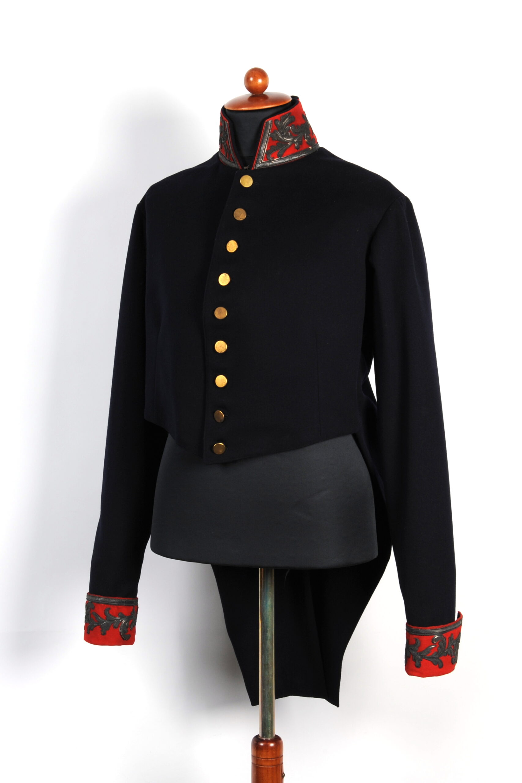
Representation: The uniform was intended for official occasions and signaled status, authority and institutional affiliation and was characterised by restrained elegance.
Collection: The sentence is almost correct, except that the AI has to add a phrase at the end that was probably not intended by the ministry officials who designed the uniform: ‘restrained elegance’. This is most likely a free interpretation by the AI.
Colour Scheme: Dark blue fabric with contrasting red, elaborately embroidered cuffs and collar.
Collection: Fine so far, but ‘ornate’ doesn’t quite suit the embroidery of a gala uniform, which symbolised rank and power.
Status: The uniform emphasised the wearer’s high rank within the postal administration. It was only worn on prestigious occasions and for ceremonial purposes, not for everyday work.
Collection: The AI knows no better than the Museum Foundation and leaves it at ‘high rank’. This is a relativisation: this may be true in relation to the postman, but probably not in relation to the senior management of the postal service. The AI probably couldn’t relate to the rank of ‘postmaster’, particularly in a specialised postal administration. However, the term ‘ceremonial’ is inappropriate for the occasions on which the uniform was worn.
Cut: Classic tailcoat-like silhouette with long coattails that emphasise elegance and rank.
Collection: Fine so far, but the term ‘elegance’ does not seem quite appropriate for a hierarchical organisation like the postal administration of the time.
Functionality: This gala uniform of a Hessian postmaster before 1846 served as representative official dress.
Collection: The AI has only added four words here to the wording of the museum foundation, namely ‘served as representative official clothing’. However, AI does not answer the question of functionality.
Decoration: Silver embroidered post horns symbolising the postal service and matt gold buttons of uncertain origin.
Collection: The AI has adopted the ‘post horns in silver embroidery’ from the Museum Foundation’s text, changed it slightly and added the note ‘Symbol of the postal service’ – this is correct. The information on the buttons also comes from the Museum Foundation, but it is more precise and longer: ‘Whether the buttons also come from the old gala uniform is somewhat questionable, as they do not show the sovereign’s coat of arms on the upper side and instead are flat and matt gold, as was typical for jacket buttons around 1970. In terms of style, they do not seem to match the uniform.’ The AI has recognised the facts regarding the buttons.
Uniform 03-c: Post-Work: Cartography of the future
This design replaces the classic, rigid structure and transforms it into an ergonomic and dynamic form.
Representation & Change: This reinterpretation shifts the focus from status & hierarchy to mobility & infrastructure. It reflects the modern perception of the postal service as a dynamic network that connects people and places.
Expert: The design of this jacket is fashionably experimental. It is orientated towards fashion trends, not the functional requirements of a uniform for the postal service. The reference to the original model has been removed apart from the narrow waist.
Colouring & Fabric: The traditional dark blue remains, but is finished in a bold, technical blue, which is accented with contrasting, visible stitching.
Expert: The look of the material suggests a medium-stiff cotton or cotton mix, which is not suitable for everyday work in terms of weather resistance and breathability.
Text & Message: The label ‘Post Work’ emphasises the change from a symbolic insignia of rank to a more functional identity – the uniform is no longer a status symbol, but rather work clothing for a mobile, networked future.
Expert: An innovative approach is evident, but the practical feasibility for workwear is not there. Merely the colour and the logo can be used well for modern branding.
Line Layout: The white seams are evocative of plans, maps or logistical networks, a reference to the cartography of the postal system – the movement of people, parcels and information.
Expert: The balloon-like sleeves and the quilted seam pattern are striking and give a creative but completely impractical look. The multiple topstitching is technically feasible, but time-consuming and cost-intensive and does not contribute to functionalit
Shape & Function: Instead of rigid lines, the design has voluminous sleeves that allow flexibility and freedom of movement – a break with the tight, hierarchical cuts of the 19th century.
Expert: This cut is absolutely unsuitable for a modern work jacket. No detail can be found here that could be used as inspiration for a multifunctional jacket that is suitable for everyday use. This is purely an item of fashion design. The wide balloon sleeves are a hindrance at work and restrict freedom of movement
ChatGPTs Conclusion: The design is a radical shift away from the historical uniform and focusses on work, movement and the modern infrastructure of the post office.
Expert’s Conclusion: The design fails to meet the essential requirements for a functional, year-round work uniform ( no weather resistance, limited freedom of movement). The cut of a work jacket should be timeless and remain fashionable for many years. This is not the case here.
Blick in die Ausstellung / View into the Exhibition
Fotos: Konzept und Text-to-Image-Prompt ChatGPT; Visualisierung Midjourney